
Ghosts was a relatively late addition to the DC line of horror titles, debuting in 1971. Like the others, it had a sensationalistic cover blurb: "If you don't believe in GHOSTS... We challenge you to read true tales of the weird and supernatural!" Not that it actually pretended any of the stories inside were, you know... Real. They apparently did add a single-page feature depicting true-life ghost stories starting with issue 37, but that seems like more of an after-thought to me. The "true tales" bit just made for great copy, and the book stuck with the premise for most of its run.
Ghosts was created by Leo Dorfman, a prolific Silver Age writer who did a lot of Superman work in the 1960s. In his time on that character, Dorfman wrote the infamous "Superman Red / Superman Blue" story, and created Pete Ross, a childhood friend of Superman's who figured out his secret identity in high school, but never said anything, instead secretly helping Supes maintain it in the interest of friendship.
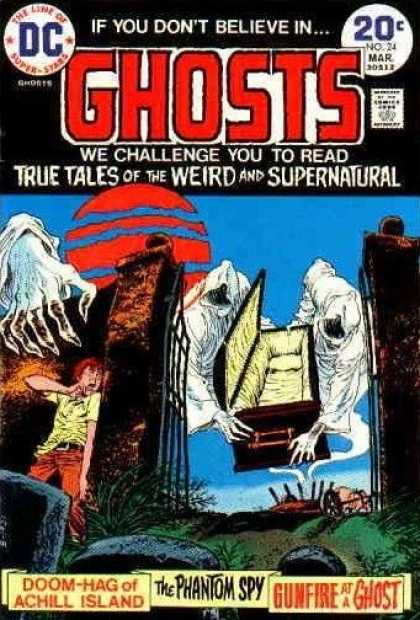
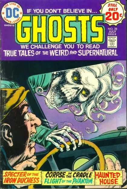
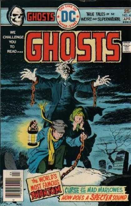
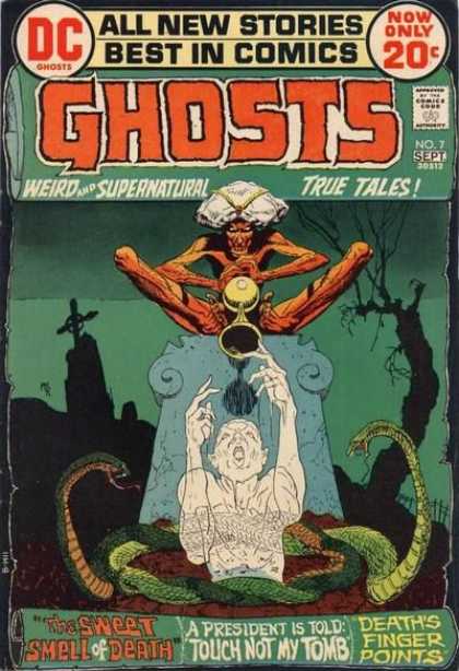
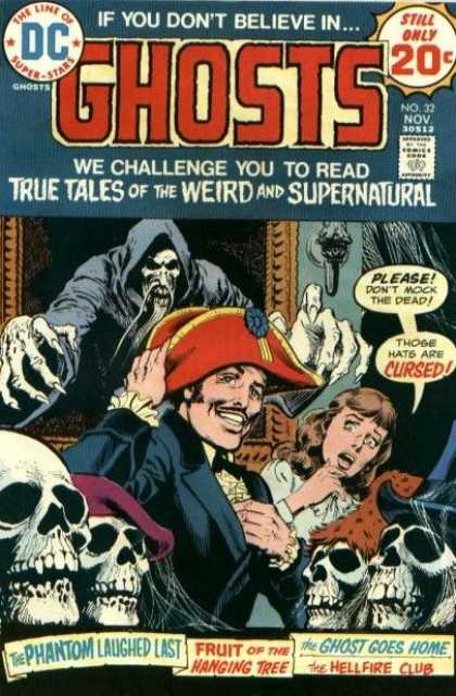
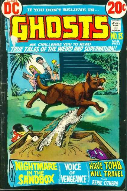
But we're talkin' about horror comics here, so let's get on with it. Like so many of the DC horror titles of the era, Ghosts featured a long series of spectacular covers, most of these from Nick Cardy, who started on the title with its first issue:

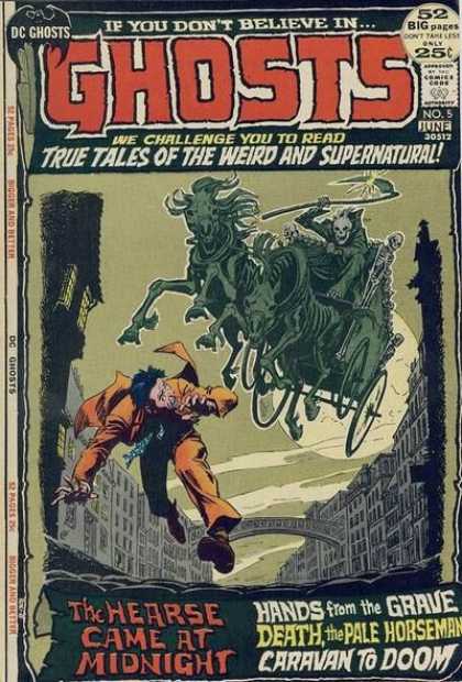
Not up to the spooky standards of the 60s work turned out by Cardy, Neal Adams, and the rest, but nice nonetheless. I like the fish-eye lens effect and odd camera angle here in particular. That string-tie-wearing reverend is pretty awesome, too. Another nice touch is the scroll that encompasses the logo, the picture, and the bottom copy identifying the stories inside. Ghosts stuck with that cover design for 14 issues before jettisoning it in favor of a more standard design. I can see why: as the DC horror titles became less an attraction in their own right, and more a testing ground for new talent, it was probably a lot easier to line up generic cover art than commission stuff to be done in the confines of that scroll. But, damn. It was a unique cover design, and I hate that they stopped using it so soon.
Another Ghosts standard seen on this first cover is the death's head. Later issues indicate a black-robed Death as the title's mascot, but on the early issues it's only a motif. Cardy did a lot of these; though it wisely wasn't done for every issue, it happened a lot, as you can see... after the jump...
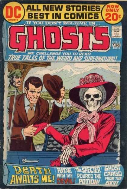
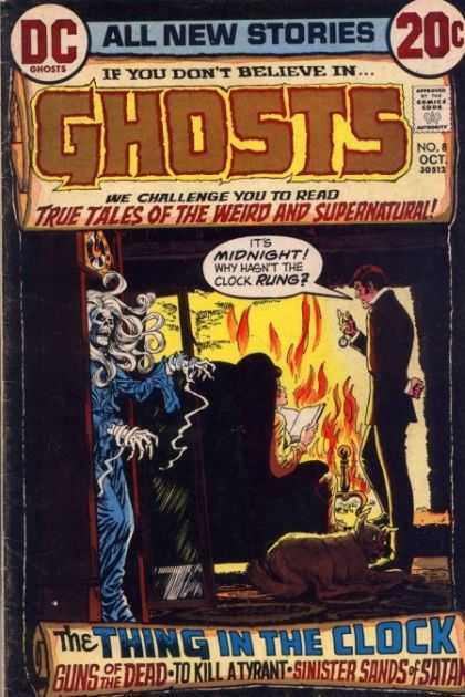
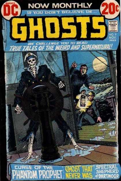
As you can see from these samples, Cardy used much more straightforward camera angles and less lurid color schemes on these books. The figures often tended more toward the square-jawed super hero comic norm, as well. The DC horror line in general had taken this approach by the 70s, and the books didn't look as good because of it. That's not to say there weren't a few gems in the mix. I like that "Thing in the Clock" cover up there an awful lot, for instance, and you'd still get occasional bits of moody strangeness like these:
 |
| by Luis Dominguez |
 |
| by Michael Kaluta |
As usual, all the above covers were taken from the excellent Cover Browser website. Go here to see all the Ghosts covers, or here for the full title list.
No comments:
Post a Comment