The sister series to House of Mystery, House of Secrets has a similar publishing history, though it started publication in 1956, after the Comics Code went into effect. Initially presenting stories of suspense, mystery and the supernatural, it shifted with changing times to giant monster and alien invasion fare before becoming the home of recurring characters like Eclipso (half hero / half villain!) and Prince Ra-Man (super-mentalist). As sales dwindled on the Eclipso series, House of Secrets was cancelled, only to be brought back three years later in 1969 as part of the horror line. And, like the rest of that line, it was blessed with a series of great covers. Most of the early ones were by Neal Adams, starting with issue 81:
Not Adams' best, nor a particular high point for DC horror in the 60s, but still a striking cover image. You'll note the bearded fellow up in the logo? The one that looks like an evil Orson Welles? That's Abel, host of the House of Secrets and brother to the House of Mystery's Cain. Why they thought taking the participants in the first Biblical murder and making them horror hosts was a good idea is anybody's guess, but I must say that it worked. Abel was a less sinister host than Cain, or maybe just less mean-spirited. Abel was plenty creepy, though. Whereas I always got the sense that Cain would be a fun guy to hang out with right up until the moment he cut your throat, Abel always just seemed creepy to me. Like the sort of guy who might have the kind of van you really wouldn't want to climb into...
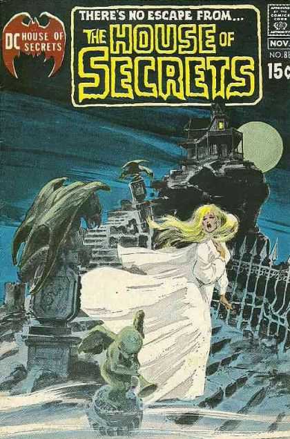
But, anyway. The covers! Adams didn't deliver such great work on his first few issues, but then, for issue 88, he turned in this stunning piece, which you can see... after the jump!
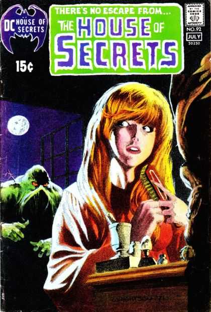
...and the quality of the covers took a decided upturn in quality. The softer lines and (I'm assuming) grey wash Adams used on that cover became something of a trademark for House of Secrets for a while. Bernie Wrightson did a run of covers for the book after that, starting with this piece of genuine funnybook history:
That would be the first appearance of the Swamp Thing, for the uninformed. A very different character than the one that debuted in his own comic a few months later, but still. That's a particularly nice piece of artwork. Wrightson didn't often play with such soft lines and washes, but he uses them to good effect here. And the effect continued to be seen on the series, from both Wrightson and others...
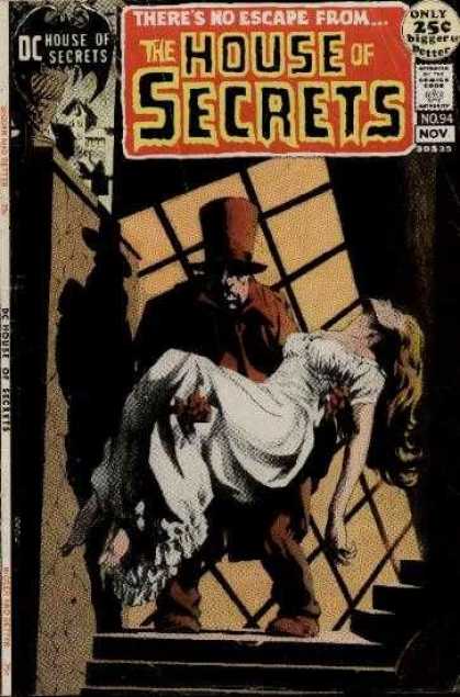 |
| Wrightson |
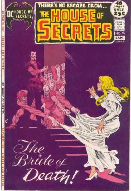 |
| Nick Cardy, trading in the rare Pastels of Horror |
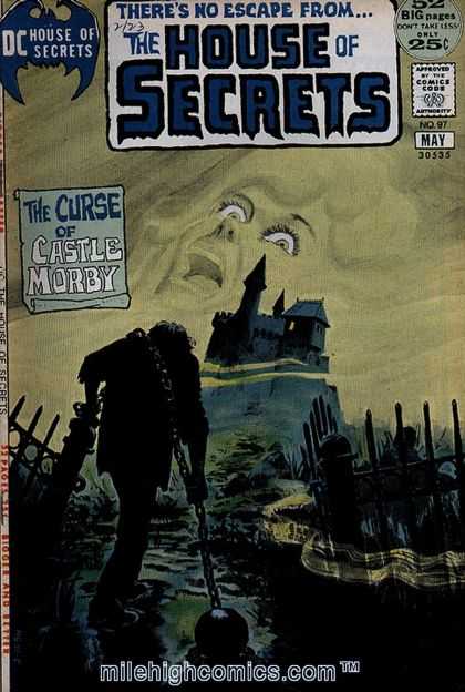
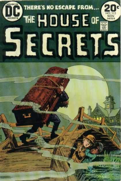
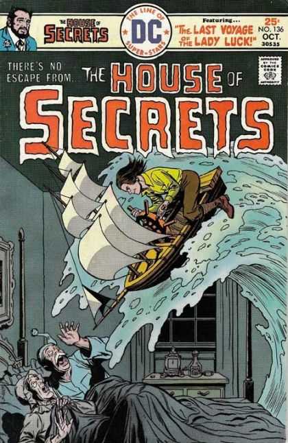
Eventually, that style faded away in favor of more tradition pen-an-ink work, but much of that was really nice, too:
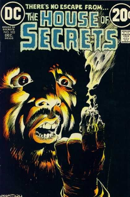 |
| Bernie Wrightson |
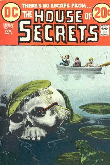
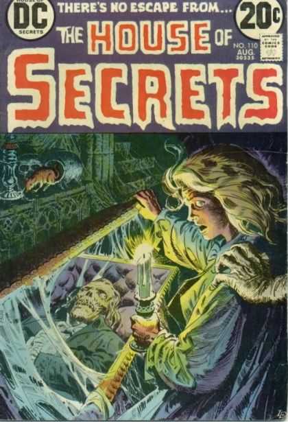 |
| Luis Dominguez |
I like that last one there in particular. It's got a very "EC" feel to it somehow. But, as with all the DC horror comics, the cover art slowly became more funnybook mainstream and four-color. There were still lots of nice covers to go, but eventually it fell to crap.
Once again, all covers are taken from the excellent Cover Browser site. Check 'em out!


Did you know you can create short links with Shortest and get dollars from every click on your short links.
ReplyDelete