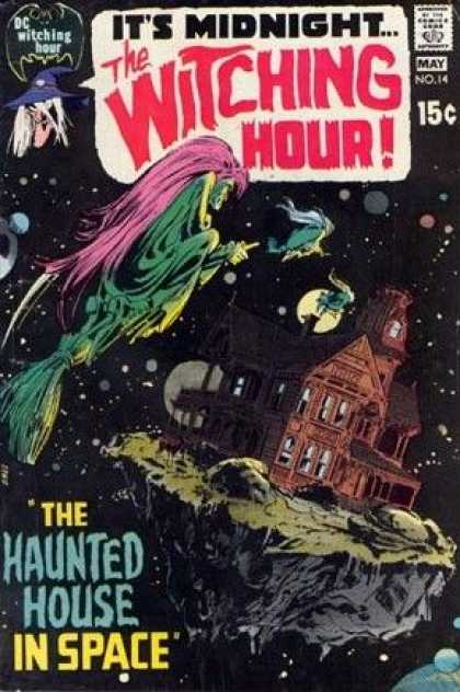
Part of DC's classic horror comic line, The Witching Hour was the relative baby of the batch, not launching til 1969 in comparison to the 1950s debuts of the more venerable House of Mystery and House of Secrets. These anthology series were profitable "try-out" books for DC through the 60s and 70s; many artists (perhaps most notably Bernie Wrightson) got their first professional funnybook work through the horror titles, and the better talents were nurtured for eventual jobs on the higher-profile super hero books. But The Witching Hour launched big, with a series of really fantastic, eye-catching covers from Teen Titans artist Nick Cardy. Like this one, from the very first issue...
Love that cover! The vertiginous perspective, the eerie green, the pose on the witch, the way the title's worked into the image as a word balloon... That's some classic-ass funnybook cover design! And it continued...
2. Not as good as issue one, but still... Better than a lot of what you saw on the racks in those days!
3. Now, this one's more like it! Another weird perspective, children in peril (bonus!), and... what the hell are those horrible things up the tree?!
4. Another nice pose, another child in peril, plus... Rain is always scary!
5. This was, I believe, the final Cardy cover, and it's a doozy.
SO nice! Great camera placement, great posing, great mustache on the fat guy... Had I been a young funnybook buyer in 1969 (instead of an infant), this puppy would have leapt right off the rack and into my tiny hands. Note also that, starting with this issue, they added The Witching Hour's hosts to the cover.
That's right; The Witching Hour, and all of DC's horror series, were patterned after the classic, doomed EC Comics of the early 50s, and therefore had their very own funnybook horror hosts! The Three Witches were patterned on the "maiden, mother, crone" triumverate of folklore. There was Cynthia (the sexy young one), Mildred (the fat middle-aged one), and Mordred (the withered crone, who may or may not have been the "mascot" witch who appeared on all of Cardy's covers for the series). They were good character designs, and those were good illustrations of them, but eventually their presense took away my favorite aspect of the initial cover design: the title being integrated into the illustration.
After Cardy's run of covers was done, no less than Neal Adams took over. And I think it's a tribute to how good Cardy's stuff was that the Adams covers kind of pale in comparison:
I mean, that's still a pretty great cover, don't get me wrong. I like the castle, especially. But it doesn't compare to what Cardy was up to on the first five issues. Adams did get off a few very striking covers, though:
Nice use of green, again, and of course I'm always a big fan of the spooky silhouette with glowing eyes. And then there's this, from the lucky 13th issue...
Nice! The skull-spider's kind of silly, but still...
And speaking of silly... It wouldn't be a Dork Forty cover gallery without a little taste o' crap. Dick Giordano stopped editing The Witching Hour around this time, and it soon degenerated into the same sort of weird-but-uninspired covers the rest of the DC horror line sported in the 70s. And that, of course, means that insanity ensued...
1. No. Just... no. (Though I do have to admit that "It's Midnight..." is a better tag line.)
2. I actually really like this one, but it's damned silly...
3. Similarly (and finally), this one is just ridiculous. And also brilliant.
All covers, as per usual, found via the awesome Cover Browser website. Go check 'em out sometime!


No comments:
Post a Comment